The Poet's Palette: Color Theory in Vintage Garment Design
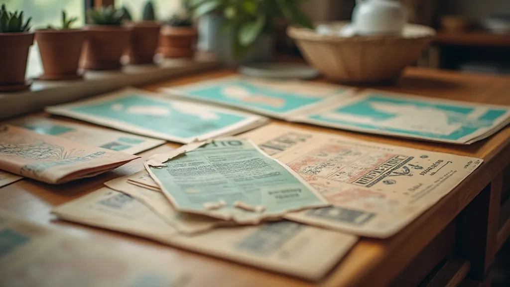
There’s a profound beauty in the quiet persistence of vintage sewing patterns. Holding one in your hands – the brittle paper, the faded ink, the meticulous lines – feels like touching a whisper from the past. Beyond the construction details and sizing charts, these patterns hold another layer of enchantment: the conscious and often deeply symbolic use of color. They weren’t merely selecting hues that looked pleasing; they were crafting narratives, evoking moods, and reflecting the cultural zeitgeist of their era. Understanding this color theory—a “poet’s palette,” if you will—allows us to truly appreciate the artistry woven into vintage fashion.
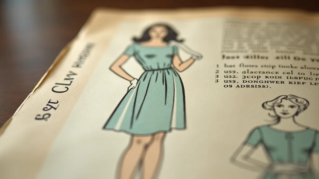
My own fascination began with a 1940s dress pattern, a simple sheath dress intended for wartime austerity. The instructions called for “dusty rose” – a color that, at first glance, seemed unremarkable. Yet, as I researched the period, I discovered the depth of that seemingly simple choice. Rose, in that era, represented resilience and hope amidst hardship. It spoke of enduring beauty in a world grappling with immense loss. It was a quiet act of defiance against the grim realities of rationing and sacrifice. It wasn't just a color; it was a statement.
The Early Years: Symbolism Rooted in Nature & Royalty (1890s – 1920s)
The late Victorian and Edwardian eras (roughly 1890-1920) were deeply rooted in symbolism. Colors were often associated with specific virtues or social classes. Deep purples, derived from costly dyes, were reserved for royalty and the wealthy, symbolizing power and sophistication. Emerald greens evoked nature and prosperity, while soft lavenders whispered of femininity and romance. The prevalence of black during mourning, meticulously dictated by social etiquette, reveals a striking example of color's prescriptive power. These early patterns weren't just about creating clothes; they were about expressing one’s place within a rigid social structure.
The Art Nouveau movement, blossoming during this period, further amplified the symbolic use of color. Influenced by nature's organic forms, designers embraced flowing lines and muted, earthy tones – olive greens, terracotta, and peacock blues – creating garments that felt both ethereal and grounded.
The Roaring Twenties: Jazz Age Brightness & Liberation
The 1920s brought a seismic shift. The devastation of World War I had left its mark, but with it came a desire for freedom, exuberance, and modernity. Color palettes exploded with unprecedented boldness. Bright, saturated hues – fiery reds, sunshine yellows, and electric blues – became emblems of the Jazz Age spirit. The availability of new synthetic dyes, like aniline dyes, made these vibrant colors more accessible, further fueling the trend. Flapper dresses shimmered with sequins and danced in a riot of color, reflecting the era's rejection of Victorian restraint.
The influence of Art Deco can’t be overstated. Geometric patterns, often rendered in contrasting colors like black and gold, lent a sleek, sophisticated edge to the otherwise playful aesthetic.
The Wartime Years: Austerity and Subtle Statements (1930s – 1940s)
The Great Depression and World War II brought a return to practicality and restraint. Bright colors were seen as frivolous and were largely abandoned in favor of muted, earthy tones. Navy blue, brown, olive green, and dusty rose – the very color from my initial inspiration – dominated the palettes. These colors reflected the era's sense of sacrifice and the need to conserve resources. While the overt display of wealth was frowned upon, however, subtle nods to luxury remained. The skillful tailoring of simple garments, the use of high-quality fabrics (when possible), and the strategic placement of small embellishments conveyed a sense of quiet elegance.
Interestingly, the limited availability of dyes also led to creative solutions. Patterns often suggested using "color-blends" – mixtures of available dyes – to achieve desired shades, demonstrating the ingenuity and adaptability of home sewers.
Post-War Optimism and the Dawn of New Aesthetics (1950s – 1960s)
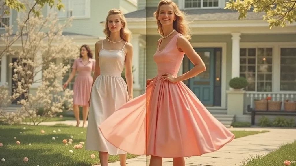
The 1950s saw a resurgence of femininity and domesticity, reflected in softer, pastel palettes. Powder blues, pinks, yellows, and mint greens evoked a sense of idyllic comfort and traditional values. The ‘New Look’ of Christian Dior, with its emphasis on rounded silhouettes and full skirts, demanded colors that accentuated the curves and created a sense of playful elegance.
The 1960s, in stark contrast, exploded with psychedelic colors and bold geometric patterns, mirroring the cultural revolution of the decade. Bright oranges, hot pinks, lime greens, and electric blues became symbols of youthful rebellion and experimentation. The rise of the mini-skirt demanded colors that were playful, daring, and utterly modern.
Collecting and Restoration: A Poet's Appreciation
For those drawn to the beauty of vintage sewing patterns, understanding the color theory behind them adds another layer of appreciation. When collecting, pay attention to not just the garment design, but also the color palette and the historical context. Why was that particular color chosen? What did it signify at the time? The answers can unlock a deeper understanding of the era and the people who created and wore these garments.
Restoring vintage patterns requires a delicate touch. Sunlight and humidity can fade colors and weaken the paper. Storing patterns in acid-free sleeves and flat files is crucial for preservation. While color restoration is possible, it’s generally best left to professionals who understand the nuances of the original dyes and printing techniques. The goal isn't to make the pattern look new, but to stabilize its condition and preserve its historical integrity.
Ultimately, the “poet’s palette” of vintage garment design reminds us that clothing is more than just fabric and stitches. It’s a form of storytelling, a reflection of cultural values, and a testament to the enduring power of human creativity. By taking the time to understand the language of color, we can truly appreciate the artistry and the history woven into these remarkable pieces of the past.