Paper Promises: The Evolution of Vintage Pattern Envelopes
There's a particular scent, isn’t there? A musty sweetness, a whisper of old paper and faded ink. It clings to vintage sewing patterns, but nowhere is it more potent than on the envelopes themselves. These aren't mere containers; they're portals to another era, tiny pieces of history brimming with forgotten aspirations and the tangible evidence of a vibrant cultural shift. For those of us drawn to the world of vintage sewing patterns, the envelope is as crucial as the pattern within – a collectible treasure and a fascinating study in design evolution.
My own journey into this world began with a single, brittle envelope. It was a 1940s dress pattern, purchased at a flea market for a few dollars. The graphics, the typography… it just captivated me. I hadn't realized then that the envelope itself was a testament to the meticulous craft of the time – a miniature work of art designed to entice and inform. This wasn't just about selling a pattern; it was about selling a dream of style, a promise of transformation.
The Early Years: Function Over Flourish (1860s - 1910s)
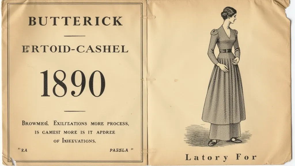
The genesis of the vintage sewing pattern envelope tells a story of necessity and early industrialization. Before mass production, patterns were often hand-cut and distributed with little fanfare. As the Singer Sewing Machine Company began to dominate the market in the mid-19th century, they recognized the potential for a more cohesive system. Early envelopes were utilitarian – primarily functional packages, often brown paper or plain manila. They listed the required yardage of fabric (a significant factor for consumers of the time!), sizes available, and rudimentary construction details. Typography was simple, often sans-serif and direct, conveying information efficiently. The focus was on practicality, not aesthetic appeal. These envelopes weren's advertising tools as much as they were essential instructions.
The advent of lithography in the late 1800s began to introduce subtle changes. Companies like Butterick, McCall’s, and Simplicity started to incorporate basic illustrations – often line drawings depicting a woman wearing the suggested garment. These weren't the glossy, full-color images we associate with later eras; rather, they were simple, black and white representations meant to offer a visual cue.
The Golden Age of Graphic Design (1910s - 1940s)
The 1910s marked a dramatic shift. The Art Nouveau influence, coupled with the rise of advertising and the burgeoning fashion industry, led to a vibrant explosion of color and design. Envelopes became works of art, featuring glamorous illustrations, often depicting idealized representations of beauty and style. The women portrayed were confident, independent, and aspirational – reflecting the changing role of women in society. Typography became more playful and expressive, incorporating decorative elements and experimenting with different fonts. Companies fiercely competed for attention, and envelope design became a crucial element in their marketing strategies.
The interwar years saw the rise of Art Deco, influencing everything from architecture to fashion. Envelope designs embraced geometric patterns, stylized imagery, and bold, contrasting colors. This era also saw the introduction of “testimonials” – short snippets of praise from satisfied customers, further bolstering the perceived value of the patterns.
During World War II, rationing and material shortages affected even pattern envelope design. Colors became muted, illustrations simplified, and the overall aesthetic leaned towards practicality and patriotism. While the glamour of the pre-war years diminished, the envelopes remained meticulously crafted, demonstrating the enduring commitment to quality even during challenging times.
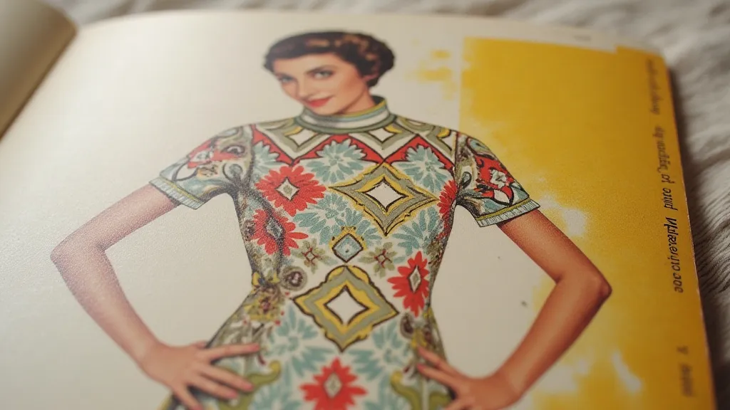
Post-War Prosperity and the Rise of Photo-Realism (1940s – 1960s)
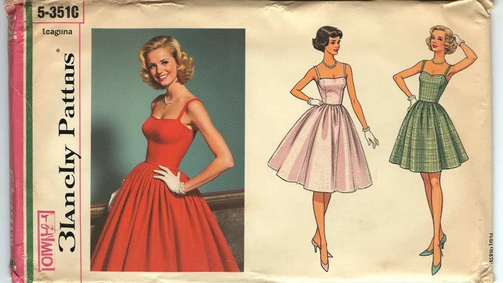
The post-war boom brought a renewed focus on glamour and consumerism. Vintage pattern envelopes from the 1950s are instantly recognizable for their vibrant colors, sophisticated photography, and emphasis on the perfect silhouette. Models were meticulously styled, their poses carefully choreographed to convey an image of effortless elegance. The typography became cleaner and more modern, reflecting the optimism and progress of the era. This was the pinnacle of the pattern envelope's artistic evolution.
The 1960s saw a move towards more youthful and experimental designs. The rise of the “youthquake” influenced fashion and advertising, and pattern envelopes reflected this shift with bolder graphics and more playful imagery. Photographs started to be more candid and less staged, reflecting a desire for authenticity.
The Decline and Legacy
The 1970s and 1980s witnessed a gradual decline in the artistic quality of pattern envelopes. Cost-cutting measures led to simpler designs, generic photography, and a general move away from the elaborate detailing that had characterized earlier eras. The focus shifted towards functionality and affordability, often at the expense of aesthetic appeal.
Today, vintage pattern envelopes are treasured not just for the patterns they contain, but as tangible pieces of history. Collectors seek out pristine examples, appreciating the artistry and craftsmanship that went into their creation. Restoration can be tricky – paper is fragile and prone to damage. Gentle cleaning with archival-quality materials is often the best approach. Avoid harsh chemicals or excessive moisture, which can accelerate deterioration.
Beyond their aesthetic value, these envelopes offer a fascinating window into the social, economic, and cultural forces that shaped the fashion industry. They’re a reminder of a time when attention to detail and artistry were highly valued, and when even the simplest purchase was elevated to an experience. The next time you handle a vintage sewing pattern, take a moment to appreciate the envelope – it’s more than just a package; it’s a paper promise of style and a testament to a bygone era.